
Cluster Analysis of Players in Division I Men’s College Basketball Teams
Basketball teams are teams for a reason. Some players are great pure shooters and others are stronger defensive players. Thousands of players ride the bench and rarely, if ever see any playing time. Coaches and athletic directors assemble varying combinations of players in hopes of optimizing their win percentages.
In an attempt to find the right mix of players to maximize win percentage I’ve used an unsupervised learning method called fuzzy c-means clustering. I’ve previously written about using this method to identify clusters of readers at Slate Magazine, but this effort goes one step beyond identifying clusters and ties cluster composition to team performance. All data for this post has been downloaded from sports-reference.com. The code and a sample of the data are available on GitHub.
How Cluster Analysis Works
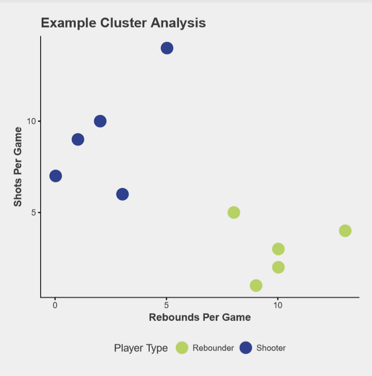
The available data includes players’ names, number of games started, minutes played, shots attempted and made, blocks, assists, steals, fouls, and points scored. To understand the clustering method, let’s start off with two pieces of information — shots per game and rebounds per game. Figure 1 is a scatter plot of 10 players with made up data. Clearly some players shoot the ball a lot and rebound very little while others rebound the ball often but rarely shoot.
After players have been assigned to one of 7 clusters, we can examine the average stats within each cluster. Each data point has been scaled and centered so this is an index rather than a raw value. Additionally, since players don’t always fit nicely into one cluster or another in fuzzy c-means clustering, each index is weighted by how neatly a player fits into their cluster.
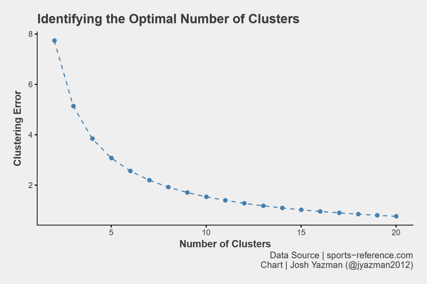
Figure 1b displays the same distribution for House of Delegates races. Down-ballot roll-off (where voters show up for the top of the ticket but abstain from voting in local races) was much more severe in places without a contested house race, which suggests house races were turning out voters that wouldn’t necessarily turn out in other districts.
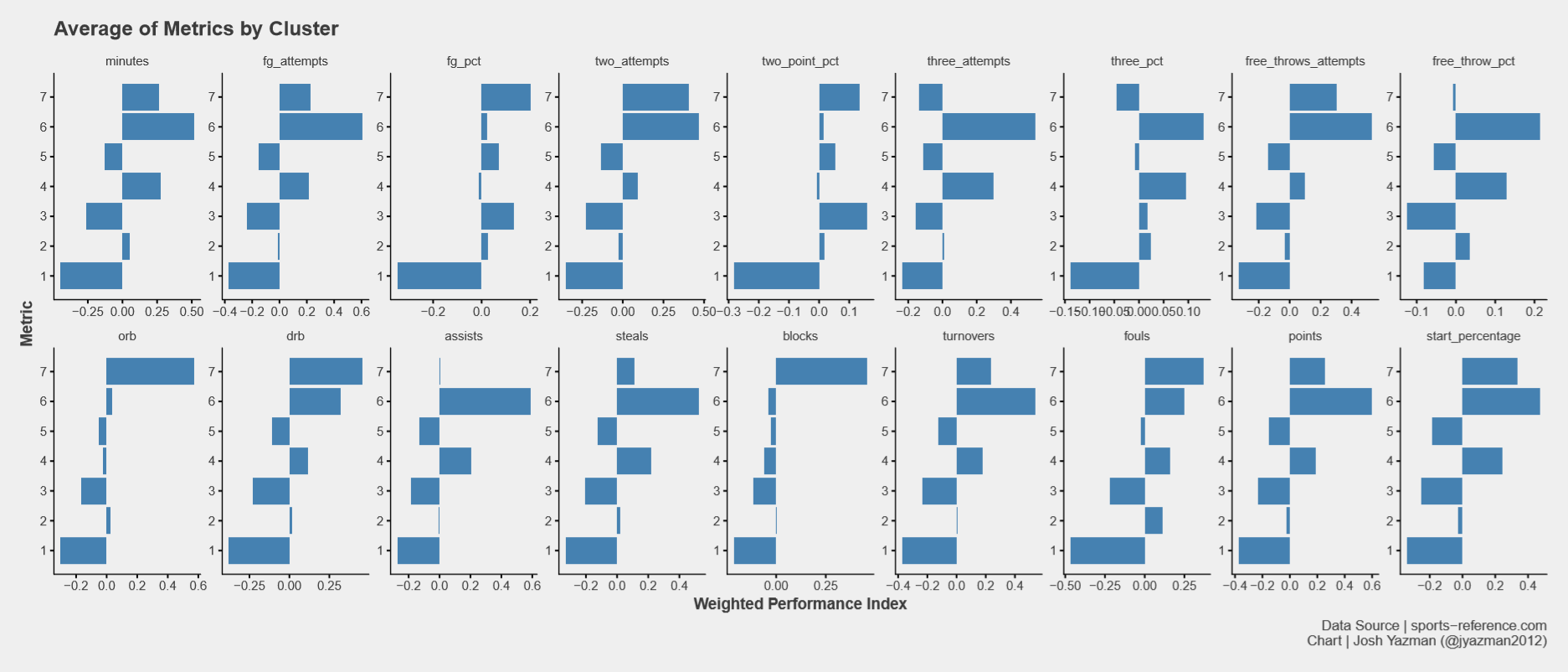
The seven clusters I’ve defined are defined below:
-
Cluster 1, The Benchwarmers, underperforms other clusters across the board. They start less often, if ever, and play fewer minutes. When these players are on the court at all, their performance lags other clusters. Example: Jordan Walker (Seton Hall)
-
Cluster 2, Miscellaneous Other, is middling across the board. They start every once in a while and play decently, but don’t offer a whole lot in terms of production or distinction from other clusters. Example: Matt Gregory (Notre Dame)
-
Cluster 3, Backup Guards, doesn’t start as often as others and they don’t take as many shots per game, but their shooting percentages are generally above average. That said, because of their low participation rates, they produce below average hustle stats (like rebounds, assists, and blocks) and don’t score a ton of points. Example: Marco Anthony (UVA)
-
Cluster 4, Small Forwards, shoot fairly often and at higher percentages than other clusters, but they’re not the best shooters around. They make up for that by excelling at assists, steals, and defensive rebounds. Example: Jalen Hudson (Florida)
-
Cluster 5, Backup Bigs, starts relatively few games and produces little, but is made up of higher percentage inside shooters. Example: Mitch Lightfoot (Kansas)
-
Cluster 6, Guards, starts regularly, shoot often and makes the shots they take. They rebound well and lead all other groups in steals, assists, and points. They also turn the ball over more than most. Example: Josh Perkins (Gonzaga)
Cluster 7, Bigs, also starts regularly. They’re much more inclined to shoot the ball inside and make those shots as opposed to venturing beyond the arc. Bigs get to the free throw line fairly often but they’re not great free throw shooters and they foul more than their peers. Bigs really stand out in rebounds and blocks. Example: Kennedy Meeks (UNC)
Finding the Best Combination of Players
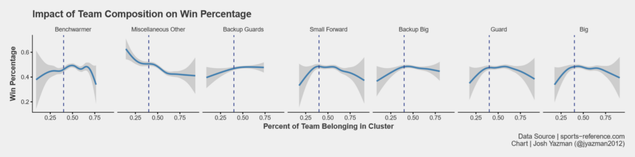
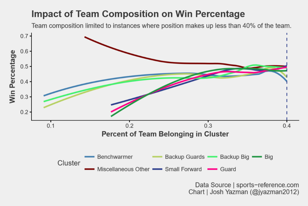
For each team in the data set, Figure 5 displays the percentage of players belonging to each cluster against the team’s win percentage. Having a team made up of more than 40% of any one player type leads to declining outcomes, which makes sense because a one-dimensional team can be guarded more easily than a team with dynamic scoring threats. One-dimensional teams can also lose out when they see offenses they’re not used to. So we know to cap player types at 40% of the team.
40% is a large proportion of the team, so what’s the ideal mix prior to hitting that cap? To answer that question, we need to find the steepest slope of each curve before hitting the inflection point. Figure 6 plots the same win percentage and cluster percentage, but below the 40% cap at each position. The slope of the curve for Bigs is steepest at first, followed closely by Guards. Those positions should be prioritized. Next is Small Forwards. The slopes of their curve is a bit flatter, but their contribution to win percentage is significant enough that they should be the next priority. Backup players of all varieties contribute less and should never make up more than 20% of a team if possible. Lastly, miscellaneous other players should be avoided. This is the only position where higher proportions of such players reduces team success.
Conclusion
We took data on college basketball player performance and developed 7 player types. Then we looked at what percentage of each team came from each cluster and compared that to win percentage. Teams that prioritize Bigs first then Guards then Small Forwards have the most success. Back-ups at each position and Bench Warmers should never make up more than 20% of the team to maximize win percentage.